U.S. Department of Labor
Redesigning How We Look at Labor
Type:
Bootcamp Project
Tools:
Figma, Paper, and Illustrator
Roles:
Solo Project
Timeline:
4 Weeks
Project Overview
Once we were given the organization, The Department of Labor, the focus of the project became figuring out what was a problem with the current website that needed to be addressed and who was a target audience that to focus on. From there the process became a matter of trying to figure how to design this website for both mobile and desktop which created its own hurdles as the Department of Labor had a laundry list of pages listed in its various tabs on the homepage alone. This is why there is a greater focus on making the information better organized and easier to find than on visuals.
User Research: Employing The Help of Users
To begin, the first thing we did was look at the current US Department of Labor website to see what some of the most glaring problems facing the website are. This included looking at how menus were structured, seeing what information was prioritized as well as noting areas that needed changes. We also took the time to create a proto-persona of who we thought might be using the US Department of Labor website. This led to the creation of Joe B. Less, a recently laid off designer that is trying to figure out how to support his family.
From the interviews, it was clear that one of the biggest issues with the current website had to do with information architecture and the fact that there are a lot of things that users can click on to learn more, but most of them are not really obvious or overlap with other options.
Affinity diagram made from the results of the interviews held
User Persona made to better understand potential users
Definition & Synthesis: Evaluating Findings For Review
After that we then went through the website to make annotations to note different aspects of the website that needed to be changed or improved that we came up with from a mixture of user testing and personal overview of the website. This was done on multiple pages including the homepage, the about us, the termination page, and the Unemployment Insurance Relief During COVID-19 Outbreak page which was by far one of the longest pages of the website as it featured information that related to every state.
Figma link to the annotations of the Department of Labor
Ideation: Changing The Conversation On Labor
During the ideation phase we also worked on moodboards, it was from this process that I came up with the idea of creating a more modern and unique logo for the Department of Labor and found out about logo designs from the 1970s for the Department of the Interior and NASA that helped to serve as inspiration for the logo that I would create for this project. Other aspects of the project that did end up coming through with this step ended up being the taking inspiration from other government websites like the White House’s website as well as of all places the California DMV.
Before beginning the design step of the project there was another round of user testing with this one focusing much more on the navigation. This ended up reaffirming to me that navigation was the biggest hurdle to overcome with this website, while also making it clear where you needed to go for finding things such as information on being laid off or starting a new business.
Prototyping (Lo-Fi)
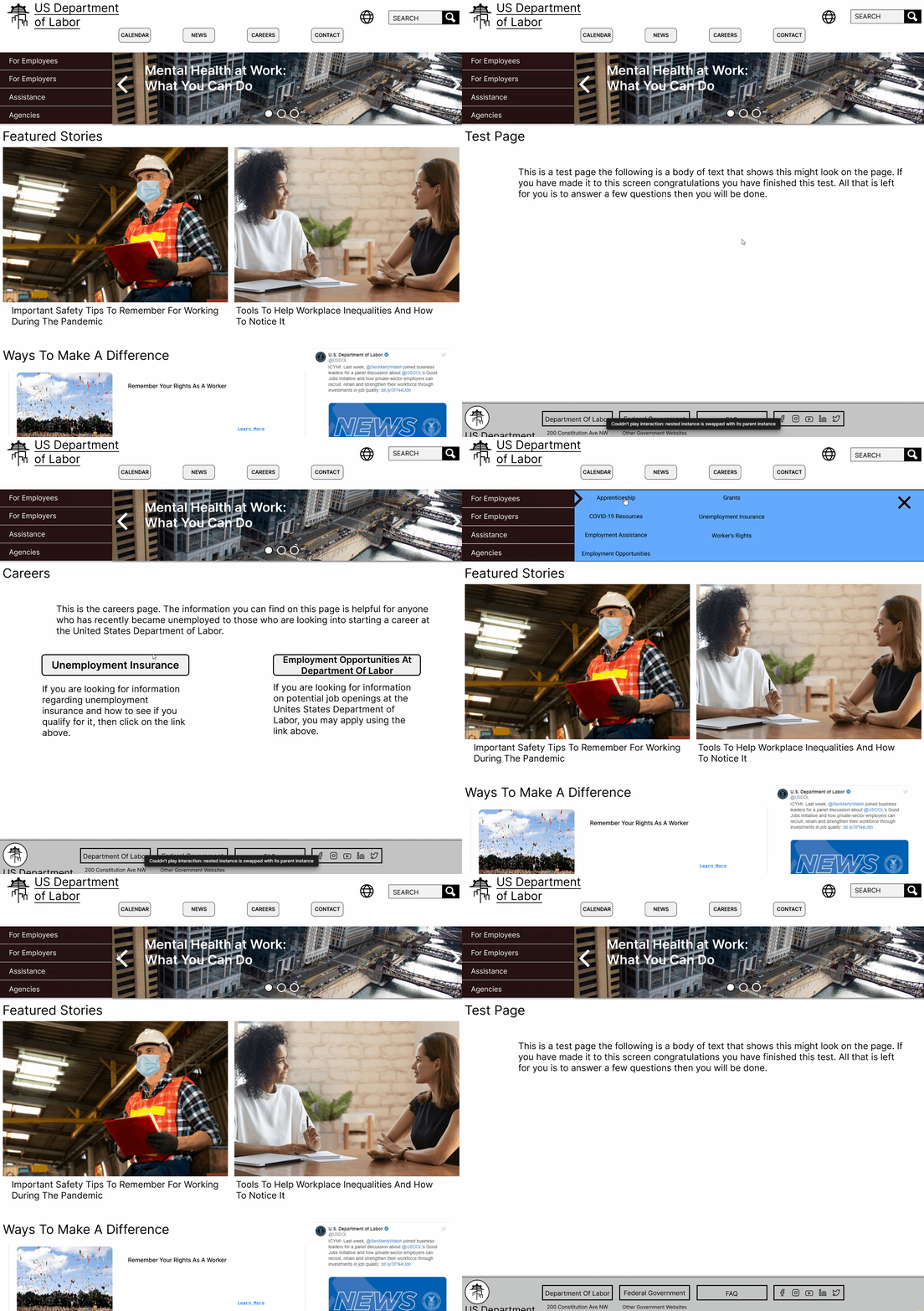
The first thing I set out doing when I was sketching out redesigns for the website was making sure the information that people would be looking for was front and center and that it was clear where on the website you had to go for each section. This is why there is the big carousel on the jumbotron as well as the four different tabs right next to it that read “For Employees”, “For Employers”, “Assistance”, and “Agencies” though the exact names and order of these tabs changes over the course of the development. This was because navigation was one of the biggest issues with the previous version of the website and that was something I was trying to correct.
User Testing + Outcomes
The general thoughts from testers was that the website seemed clean, but clearly still a work in progress, they liked the arrow that appeared next to the one of the four topics when you click on it was an interesting way to show where you were, the footer seemed to have a good layout with specific notes to the fact that you can find the phone number at the bottom of the screen, and lastly, only one person noticed that the word carousel on the prototype was misspelled.
Conclusion + Future Opportunities
I was able to learn a lot from this both when it came to having to think about designing a website for mobile and desktop at the same time, but also the importance of remaining consistent when designing.
As for what I hope to do in the future with this project, I hope to continue to build out the website in both terms of usability and design, I hope to work on a tablet version of the website as neither the desktop or mobile versions of the website that I made are optimized for a tablet, lastly, my biggest point that I would want to change is to find more ways to incorporate elements from the logo redesign. I say this because the new logo has a strong sense of theming and a unique identity to it that incorporating elements of it into the rest of the website would be a missed opportunity.


